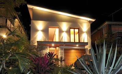
There are so many beautiful pictures out there for interiors, trying to find inspiration for an exterior is a tough one. So when LBC were asked to gather up some inspiration for a house here in Melbourne with a modern contemporary edge, we rose to the challenge! See below some inspiration that we found or beautiful modern exteriors.
 |
| from here - slant and square- interesting shapes and dimensions |
 |
| From here like the roof and the glass combined together- interesting shapes |
 |
| Made by "Like Butter" balustrade, the reason for this photo is that "Like Butter"make gates aswell as other things and a design of a gate or wall feature could be added to the front of the house.if you look below I like the idea of more of a geometric shape or circles | | |
|
|
 |
| Water Feature from The Butters which is a design team that design gates, balustrades, water fountains, lights, set design for film and are based in Kensington |
|
 |
| Lights Made by "Like Butter" |
|
 |
| But Perhaps Geometric Shapes, circles would look great as a feature in front of the house, side gate or wall, look at this wall panel from here |
 |
| Geometric Wall panel, could be made out of industrial material by Like Butter above |
 |
| I like this wall panel, the pattern from here |
 |
| Panels could be made out of a industrial material for out the front of the house (these are wood panels) from here |
 |
| From here the use of shades is effective |
 |
| I like the windows and the industrial look from here |
 |
| I like the panelling in this from here |
 |
| Vader House by Andrew Maynard Architects in Melbourne |
 |
| Truro Residence here |
 |
| The Carillo house from Apartment Therapy.com the different use of textures on a house is interesting |
 |
| From The Hover House |
 |
| From Works Partnership from here industrial textures coupled with garden that softens it |
 |
| From here I like the different materials used on this house |
 |
| From here again the slant roof is interesting |
 |
Industrial look from here
|
|
|
|
 |
| From here clean look |
|
|
 |
| Would you believe this is a church in Colombia, I like the point of difference the Wall from here | | | | |
|
|
 |
| from pintrest |
 |
Maybe some type of panelling or feature gate would add some new dimension to the look from here |
 |
| Hersh Bender Architects here |
 |
| Close up of front by Hersh Bender Architects here like the feature to the right |
 |
| Like the glass Window in this one from here |
 |
| Front of House In Mosman in Sydney by Corben Architects see web reference further down the use of wood is nice |
 |
| From Studio Paralelo designed the Bertolini House in Bento Gonçalves, Brazil. |
 |
| La Finca from A-Zero Architects here |
 |
| I know this is the back, the slant roof is effective here and I like the black | | |
|
|
|
|
|
|
|
|
|


No comments:
Post a Comment